Golden is a startup, building a self-constructing knowledge base using Artificial Intelligence. I suggested the topic page redesign and potential solutions.
I. Insight
Since Golden officially launched only a few months ago, and the product is still in its early stage, I came up with a hypothesis for the user and Golden at the moment based on the feedbacks from Product hunt.User wants
to learn about the topicto explore more around the topic
to contribute on the contents of the topic
to rank up by contributing
Golden wants
to acquire more usersto fill up the empty contents
to encourage the users to contribute
to promote product’s AI feature
II. Identifying problems (current layout)
Based on the hypothesis, I went through the topic page and found some areas that have potential for a better user experience.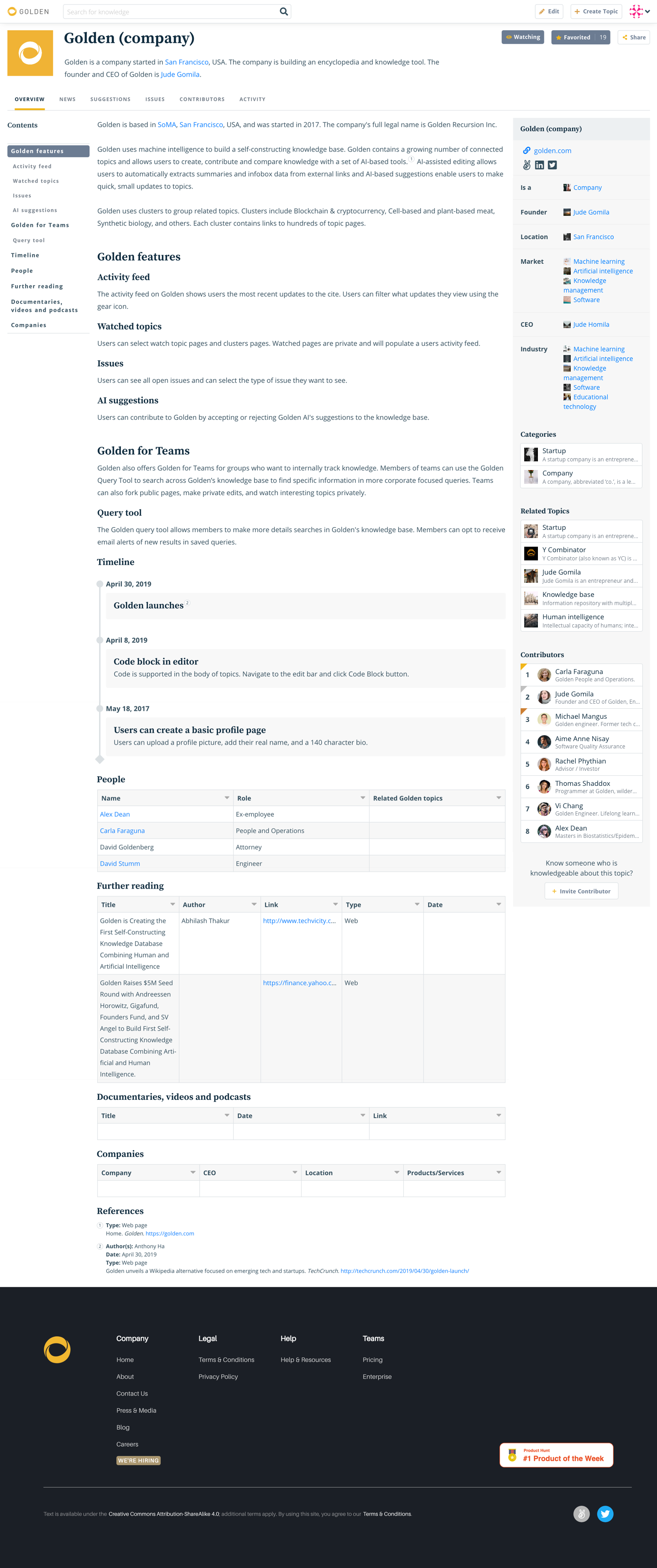
1) The navigation bar at the top and the infobox at the right have similar functions; learning about the topic and encouraging the users to be engaged.
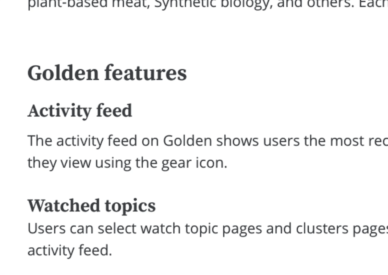
2) There are too many typography styles which could distract the user’s readability.
3) Lack of consistency; different but similar shades of gray, low text contrast, and various button sizes.
2) There are too many typography styles which could distract the user’s readability.
3) Lack of consistency; different but similar shades of gray, low text contrast, and various button sizes.
III. Goals
1) Strengthen the user flow. Eliminate the possible interferences through user experience.
2) Build consistent visual elements
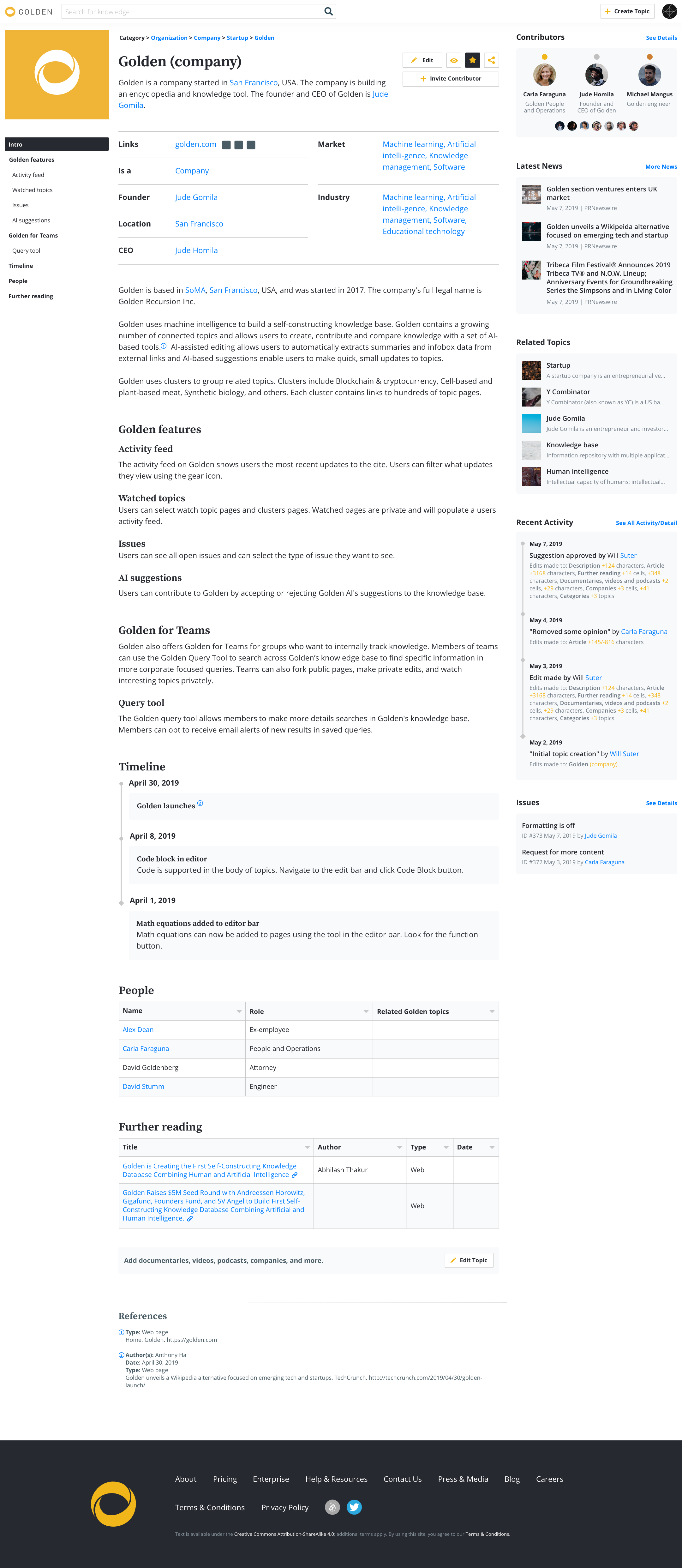
IV. Analyzing elements’ properties
To re-construct the layout, I investigated each elements from the original layout and organized them by its properties and characters.
Contents ![]()
Header
-Topic title
-Bio(summary)
-Thumbnail
-Infobox(summary)
Body
-Contents
Footer
-References
Header
-Topic title
-Bio(summary)
-Thumbnail
-Infobox(summary)
Body
-Contents
Footer
-References
Action ![]()
Read(Topic page)
Edit
Create Topic
Watch
Favorite
Share
Explore![]()
-Categories
-Related Topics
-News
Read(Topic page)
Edit
Create Topic
Watch
Favorite
Share
Explore
-Categories
-Related Topics
-News
Engaging ![]()
Suggestions
Issues
Contributors
Recent Activities
Invite Contributors![]()
Suggestions
Issues
Contributors
Recent Activities
Invite Contributors
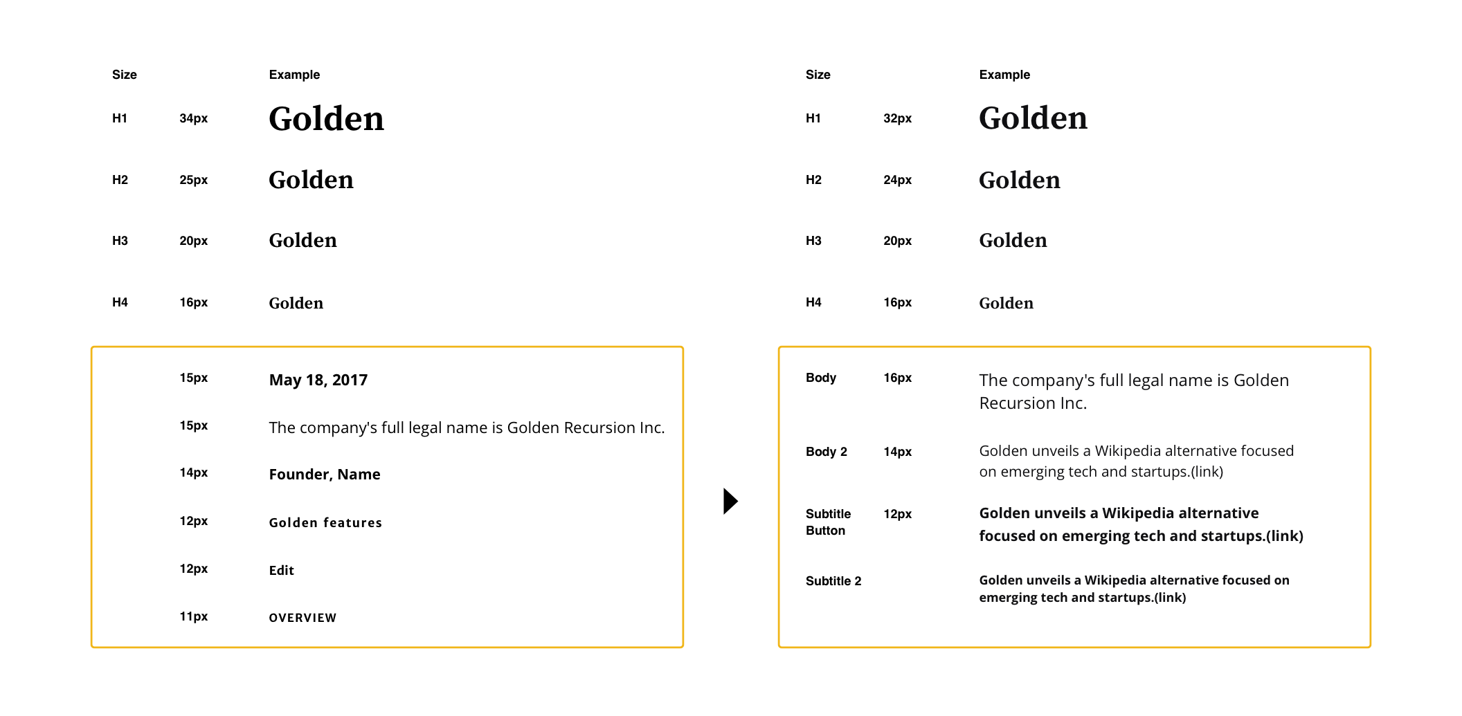
V. Designs
As a starting point of refining visual identity, I cleaned up the color palette and the typography style. 
Solution A,
Subtle iteration for utility
This direction keeps the similar grid of current layout, but offers better experience by bringing explorable items on the right shelf.
The right column became the feed. I moved the contributors to the top, which may possibly encourage users to contribute for a higher rank. Then the user can see the latest news related to the topic in the same page that helps them to explore more easily. At the bottom, the user can check the latest activities of the topic page.
Solution B, Stronger focus on AI
This layout promotes the AI features stronger, and the drastic design change may acquire new users as it stands out among the competitors such as Wikipedia.

As the user hovers the cursor over, a little yellow pencil icon shows up next to each section titles for the users to edit the contents on a single section easier.


Instead of showing an empty table, I combined it into one consolidated banner.
VI. More ideas
Not only for your eye health, but also it looks cooool.
More accessible function for a wordy platform.